Share
After fifteen years, Subway is getting a new logo. In order to aggressively compete in the food services industry, the restaurant is in the process of rebranding itself and refreshing its image.
The restaurant was established in Connecticut in 1965 by a 17 year old boy, Fred DeLuca. Originally, his intent was to run the restaurant in order to pay for his university. The idea was suggested to the boy by a family friend, Dr. Peter Buck, who wanted to partner up with Fred.
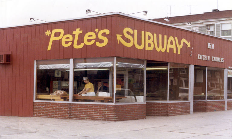
The two opened up their first Subway restaurant in August of 1965 and called it “Pete’s Super Submarines.” Not long after, the name was shortened to “Pete’s Subway” and two additional locations were opened as well. During the name change, the duo also introduced the yellow logo which Subway became known for over the years. Since then, there have been minor tweaks and adjustments in the logo but the yellow remained a dominant colour. Years later, Peter was eliminated from the name and what remained is the world famous name: “Subway”.


The new logo was debuted during the opening ceremony of the Rio 2016 Olympics. Much like the old logo, the new one has kept the iconic arrows on the “S” and “Y” but took out the bold border. The white and yellow with a green border are no longer but a more simplified minimalist design, aimed to the modern consumer. The old logo had a more dynamic look and feel to it. What remains is a cleaner and flatter looking logo, with the signature Subway colours.
Although the logo did not change much over the years, it is nice to see that it’s getting a facelift. The fresh logo is expected to roll out across all Subway restaurants worldwide in the early 2017.