Share
Even though technology is evolving at an alarming rate and becoming an inseparable part of our everyday life, there are still a few old school brands that have stuck around. Kodak is one of these brands and it has recently announced that it is getting a new logo by in part bringing back the old one.
Work-Order, a New York-based studio that designed the new identity explains the idea behind the identity change:
Our goal: To reinstate Kodak’s Trade Dress colours and the Kodak K symbol, update the logotype and provide a simple system based on the colours, the logo and the typeface Graphik.
Rollout strategy: We want the logo to be part of the organic structure of corporate rebuilding, appearing on new initiatives and informing future decisions. We don’t see this as a big branding announcement. Instead, we seek a dialogue about honouring a legacy and letting a company rebuild with integrity and dignity.
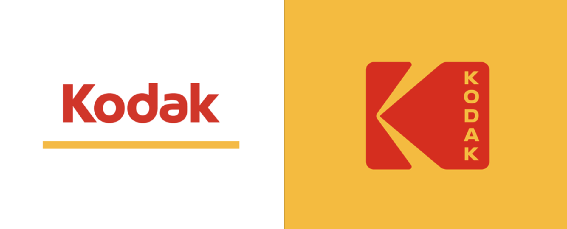
971 Kodak logo, 2006 logo and the most recent update
The new logo pays respect to its roots by bringing back the camera-shutter icon but in a cleaner and more minimalist way. The typography is clean and modern, bringing back a sense of being current and cool. The word “Kodak” is stacked vertically within the camera-shutter icon rather than horizontally such as in the previous logos. It definitely gives the logo a new spin and makes it stand out in a good way. Kodak literally took the old and made it marketable in a new and fun way. Combining the logo with its modern yet minimalist packaging, Kodak is set to do great things.
Kodak is an iconic brand that most of us have fond childhood memories of, and can relate to in one way or another. The good old days of not being able to preview pictures and developing Kodak films into memories. They don’t call it “a Kodak moment” without a good reason. The company which was established in 1888 is historically known for its consumer electronics such as cameras and camcorders. In the professional forum, Kodak has made an impact by offering cost effective print systems and other such enterprise solutions.
The Ektra smartphone
Presently, the technology giant has expanded its offering. An example of this is its recently released smartphone, the Ektra. It is a smartphone that is geared towards photography from the ground up. The other promising piece of technology is the “Super 8”, an affordable camera that is geared towards producing high quality video for film.
Kodak currently offers all of the above, plus “software, hardware, consumables and services related to graphic arts design, assistance with publishing and packaging, commercial printing, electronic displays, entertainment and commercial films, and last but not least, consumer products markets.” That’s a long list of offerings from a company which started with a single product, a camera.
“I don’t think of what we’re doing as ‘bringing back’ the iconic identity of Kodak, because in people’s hearts and minds, I don’t think it really went away. It’s simply logical to keep one of the world’s most famous brand marks at the forefront of the company’s image and identity.