Share
Whether it’s Wal-Mart’s “Great Value” or Costco’s “Kirkland Signature”, we are all familiar with generic brands. Some are quite boring in terms of image and marketing. Here’s an interesting marketing twist in promoting “generic”, or “no name” groceries.
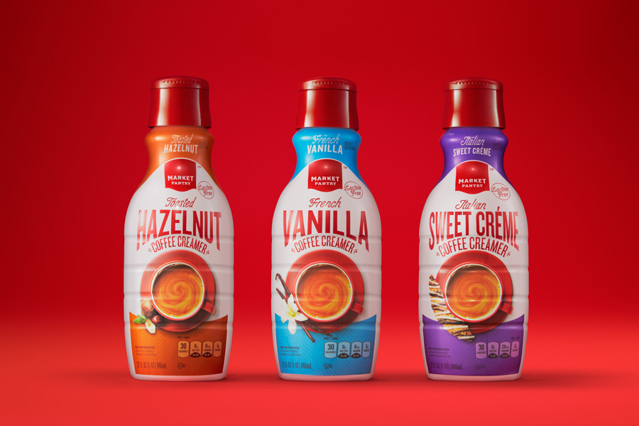
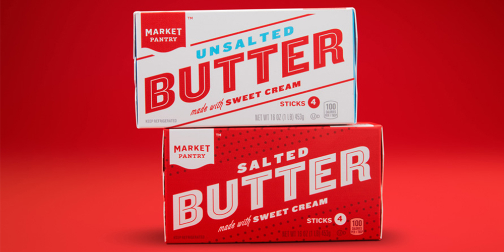
If you’ve ever shopped at Target during its short-lived stay in Canada, you would have most definitely seen their “generic” Market Pantry line. This line of groceries contains 2,250 SKUs in over 100 categories and, for obvious reasons, is one of Target’s preferred brands.
According to Target, the “Market Pantry” line was doing well but not as well as it could have. What was obvious is that the current image lacked personality and was perceived as something that was lower quality. Moreover, it was just plain old boring. Therefore, it needed a refresher.
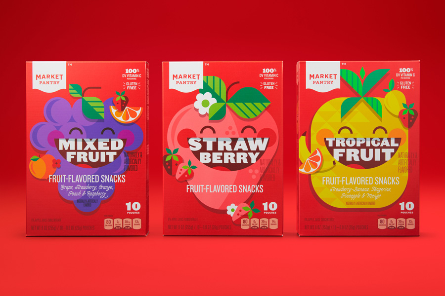
They rebranded their “Market Pantry” line as something that now comes across as very traditional, with a sense nostalgia and heritage. It feels like it came out of your Grandmother’s pantry rather than a retail giant’s warehouse.
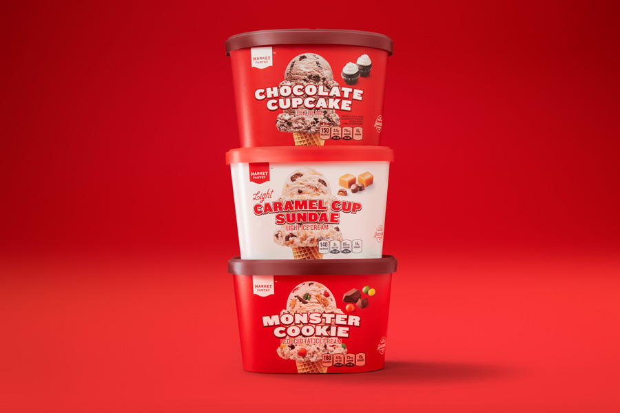
How did they do it? What they discovered through consumer metrics is that the colours red and white are viewed as a sort of signature colours of the Market Pantry line. By combining expressive typography, beautiful photography, clear navigation, and their signature colours, Target managed to create something that screams “preferred choice” rather than a “compromised solution”.